Design19 Jul 20246 MIN

It’s all about the feeling for architect Suchi Reddy

The award-winning NYC-based architect keeps the human mind at the centre of her designs

feature image the nod mag

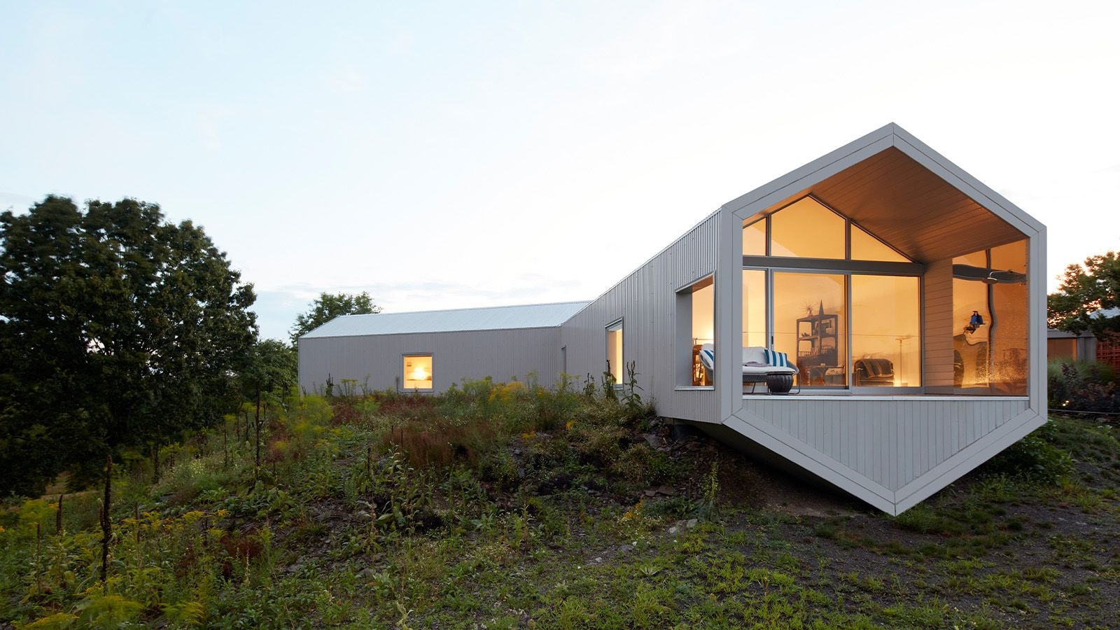
The Salt Point Residence was created by Reddy in close collaboration with artist Ai Weiwe

Photograph by Ashok Sinha

Even as a child, Suchi Reddy knew her home was special. It was the early 1970s, and her hometown of Chennai (then Madras) was one of the country’s busier metropolises. Still, she always came home to the rare privilege of nature. Her house, built around a central courtyard, opened out to a garden on all four sides; her family would often have dinner on a blanket spread out in the lawn under the moonlight. “The smell of the jasmine and the temple trees, the textures in the house, the warm wood against the light…I was constantly attuned to the materials around me,” she recalls nostalgically. “This sort of sensitivity to both nature and humanmade atmospheres was something that was ingrained in me. I remember having a strong feeling that the space was making me the person I was going to be.”

Reddy moved to the US at age 18, earned a degree in architecture from the University of Detroit Mercy, and finally in 2002, founded her firm, Reddymade Architecture and Design, in New York City. Reddy made has designed residences, offices, stores, and public art installations across the world—and none of her designs have escaped the impact of her childhood home. While her peers were aligning themselves with Brutalist or postmodern traditions, Reddy was busy chasing an ineffable feeling: designing spaces with the hope of conjuring up the same experiences that she associated with her own home—wonder, serenity, security, and a strong sense of community. She even came up with a term to express this idea: she was designing for the “democratic space of the body”.

While spaces at home are often designed to create certain moods or experiences—many architects suggest warm wood flooring in bedrooms, for instance, and living rooms washed in reflective whites—Reddy brings this tendency even into her commercial projects. Her own office stands as a prime example: you walk from the clamour of Manhattan’s Greenwich Village into a zen-like sanctuary dotted with mantras and monochromatic artwork and textured wood that all seems to absorb the chaos of the city, before leading you into the heart of her bustling office. “Feelings are actually a series of chemicals in the body,” she explains, “And those are constantly being affected by different interactions and different atmospheres.” About 15 years ago, she realised there was a scientific study dedicated to exactly what she was doing: neuroaesthetics.
Neuroaesthetics, as the portmanteau suggests, is the study of aesthetic experiences at the neurological level. The term was coined by neurobiologist Semir Zeki in 1999, but has only recently come into popular design lexicon. It rejects reductive notions about space, light, and colour popularised by industrial design (“white is calming” or “red is activating”) and instead considers the broader context within which aesthetic choices operate. For example, white could, of course, be soothing when paired with soft textures, but jarring on a polished surface or if paired with a cool, light temperature. For Reddy, this was a validation of her own approach to design, which she has now begun to consciously hone through dedicated study and regular collaborations with institutions like the International Mind + Arts Lab at the Johns Hopkins University. In 2019, she was part of a team that designed A Space for Being, a Google showcase for Milan Design Week that was equal parts exhibition and experiment. Audience walked through three differently designed rooms while wearing a wristband that recorded their physiological responses to each one—it helped understand how light, space, colour, and even other people, impact us on an individual level.

Two years later, she brought these principles into her design for Google’s flagship hardware store in New York City. The pandemic lockdown had just lifted and people were excited yet wary of sharing space. At the same time, Google was on a mission to make its tech softer, more textured, less metal-and-glass and more interior-décor in its aesthetic. With some careful, feeling-forward design, Reddy was able to straddle the two narratives quite appropriately. She balanced out the Google colours with textured cork and wood furniture while segmenting the long, narrow interior with a wire-frame sculpture—like a doodle brought to life—that made social distancing a lot easier.


Then there’s her 2023 installation of reflective metallic sculptures for the interior courtyard of the National Building Museum in Washington DC. The idea was to draw attention to the architecture of the space, but at the time, the country also happened to be commemorating the 60th anniversary of the March on Washington, and there was an hard-to-ignore sociopolitical conversation in the air. “I really wanted people to be able to see themselves reflected in the place,” she expresses. “I wanted to create this melding of perspectives that would allow people to see themselves in the context of the architecture, but also the psychological context, of Washington DC.” The installation did the job of drawing attention to the ornate architecture of the building, reflecting the audience to itself, and generated a sort of kaleidoscopic effect that meant you could never see the same view, or take the same picture, twice. “I wanted to give people this experience of awe and wonder,” Reddy says. “They’re very democratic feelings, they’re equalisers.”

It’s not easy, though, to design for democratic feeling. Everyone experiences the world differently. Private residences, which are meant to cater to the emotional needs of a limited group of people, are relatively straightforward, but public spaces host visitors from across the neurological spectrum. A texture that one finds soothing may be unsettling to another; a space that makes one person feel a sense of communal connection might overstimulate someone else. It’s a constant dance of figuring out what a particular typology requires, and what it can do without.

Look Here © Chris Coe.

‘Look Here’, a public installation designed for the National Building Museum in Washington DC

Photograph by Chris Coe

Right now, Reddy is particularly intrigued by how these principles may be applied in the design of recovery rooms. In a recent collaboration with the International Arts + Mind Lab, she developed a prototypical Sensory Healing Room that could aid in patient recovery. The space has soft curves and easy-to-clean surfaces that don’t give the impression of sterility, which is signature of most hospitals. It is ensconced in screens that project soothing imagery. Most importantly, Reddy has designed accommodations to separate the caregiver’s space from the patient’s, so that the stress of one does not impact the other. While the space is a prototype for now, she’s hoping to soon develop them for hospitals and other recovery centres. “In fact, we’d also love to design care spaces for families who are waiting to hear about patients,” explains Reddy. “Waiting rooms can be such stressful spaces, so we’d really love to redesign them in ways that reduce cortisol and adrenaline, and bring down the fight-or-flight response that people go through in those life-or-death situations.”

KKI View One credit Reddymade

Reddy's recovery room prototype imagines a feeling-forward approach to healthcare

Courtesy Reddymade

While the hope is that these recovery rooms will become a staple in healthcare someday, Reddy’s practice continues to be anchored in emotion—even outside of traditional wellness-oriented projects. She recently completed a Chicago store for ergonomic furniture brand Humanscale, in which she used a pared-back material palette to foster a sense of expansiveness and exploration. In October this year, she will be launching a furniture line in collaboration with Indian design label Ekaya, which is inspired by the contours of the human body and the many ways a sari can be draped around it. “Our work crosses a lot of typologies,” she admits, “but it always begins with asking the right question: who is using this space, and why?” In this vein, Reddy has recalibrated the well-known adage “Form follows function” into her own personal motto: “Form follows feeling.” Function can never be ignored, she agrees, but design needs to dig deeper, down to the core of who we are and how we exist in the world. “You never think about a spider without its web,” she concludes. “So you can’t think about a human as separate from their environment.”